A zoomed-out screenshot of the ATES layer outside Crested Butte.

A zoomed-out screenshot of the onX ATES layer outside Crested Butte.


In the past few years, onX has shown a strong commitment to advancing their backcountry platform—the company has released a new ATES layer for select U.S. regions.


I’ve had an opportunity to use onX Backcountry for the past few months. My primary reason for learning more about the platform is that onX has released a few new layers on their backcountry platform. According to onX, the layers can help winter backcountry users plan and execute safer trips. 

onX has added three new layers of interest: ATES, Avalanche Runout, and Avalanche Potential Release. According to onX, they use many different inputs to derive the ATES layer, which includes the runout and potential release layers.  

The onX site states, “This initiative involves compiling existing information and firsthand observations used by an avalanche and snow safety experts to assess local terrain avalanche risks, constructing geospatial models that predict avalanche release areas and potential zones based on factors like slope angles, wind patterns, and forest density. This resulting ATES terrain classification offers crucial insights for backcountry users.”    

Full disclosure: onX provided a two-month subscription with the new layers activated.  


Learn more about planning with ATES

Learn more about the ATES rating scale


Avalanche Terrain Exposure Scale Layer (ATES)

I’ll quote myself from a previous article on The High Route. “The tried and true public ATES paradigm uses three classifications: simple, challenging, and complex. Depending on your objective, skills, and experience, an ATES rating provides some historical context to one’s relative exposure to avalanches. An ATES classification is static: it does not change due to a day’s or week’s forecast or known instabilities—in other words, the likelihood of an avalanche occurring during your tour on any given day. The ATES becomes a reliable and fixed system we can rely on. The goal is to give the public user a tool to help them differentiate between different trips and, combined with a current forecast, choose a trip that fits the conditions.” Again, the ATES scale and any ATES color coding you may see on a digital map or a ski tour atlas are independent of the day’s forecast.  

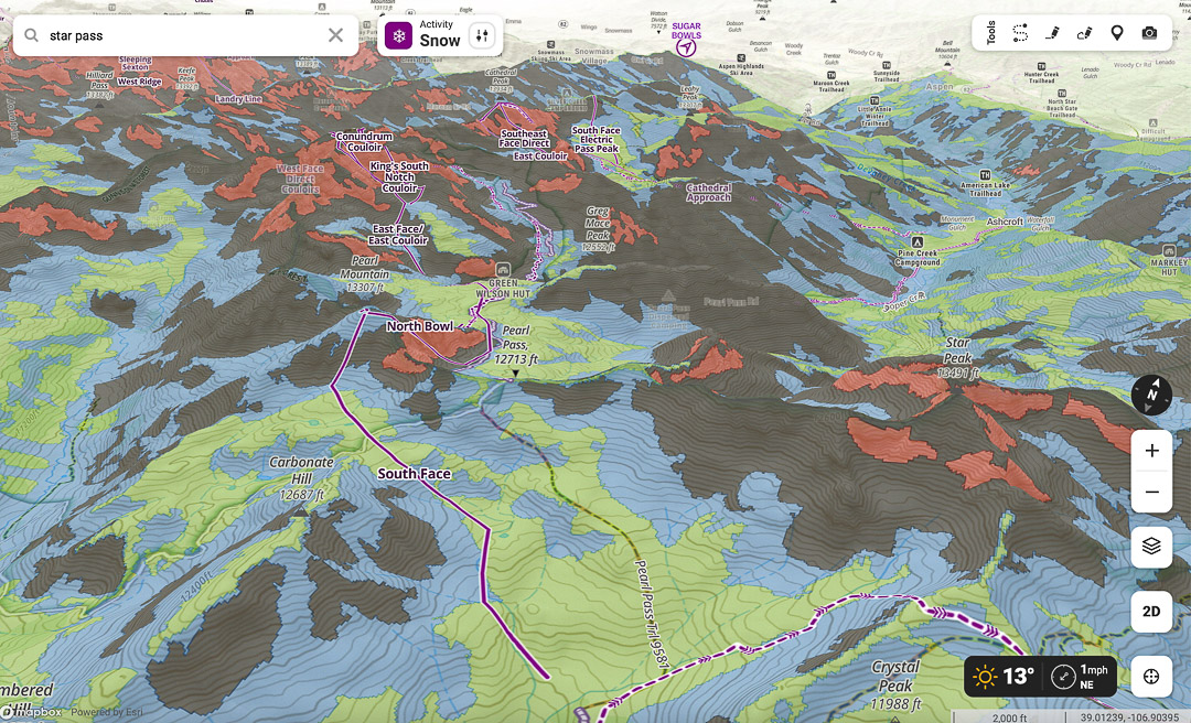
The onX ATES layer has been introduced in specific Colorado, Montana, and Utah zones—plans are to expand coverage in those states and broaden it to Washington, Wyoming, and Alaska. The map below shows onX using the new ATES rating scale: Colors code for the terrain’s avalanche exposure: Simple (Green), Challenging (blue), Complex (black), and Extreme (red). 


ATES layer

ATES layer.


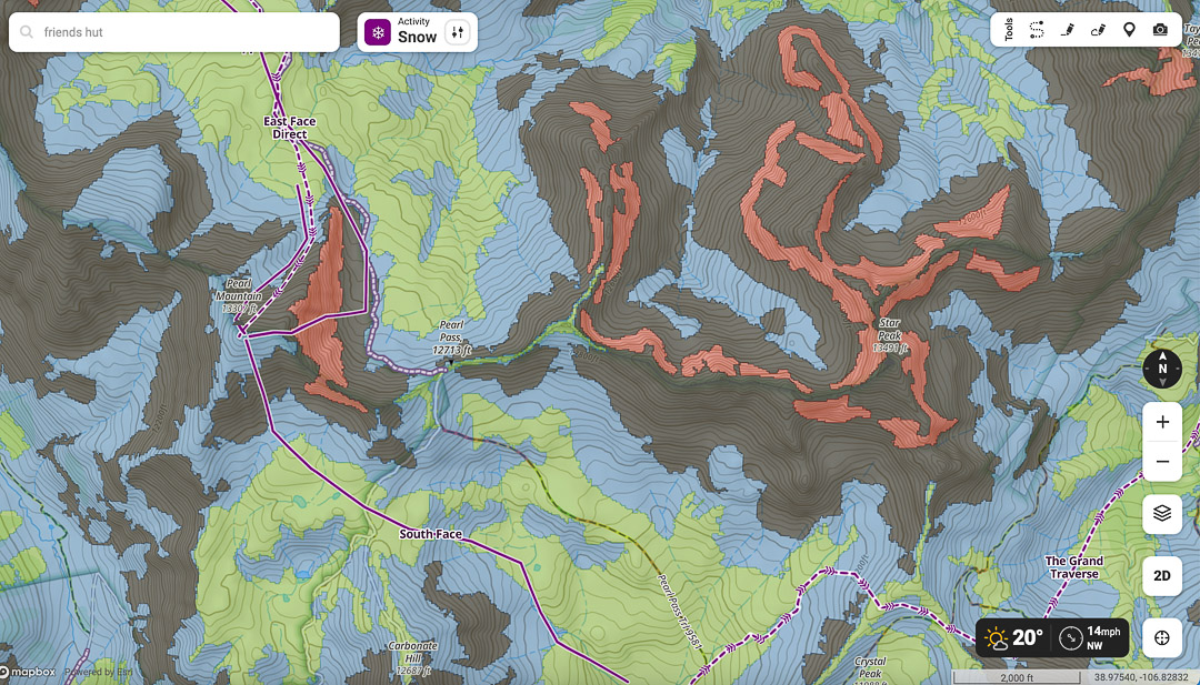
Avalanche Runout Layer

onX states, “The Avalanche Runout layer visualizes the potential runout zones of an avalanche. onX Backcountry worked with local avalanche professionals to understand typical and historic avalanche alpha angles for each unique region. These inputs from local professionals are directly reflected in the model and runout visualization for each individual region.” 


Avalanche Runout layer

Avalanche Runout layer.


Avalanche Runout

Avalanche Runout info form onX.


Avalanche Potential Release Area (PRA)

No doubt, this is an interesting layer and one to assess when planning. Would I or am I making hard and fast decisions based on this layer? Hard no. The layer also highlights the advances and limitations regarding digital apps and the information we want to see represented. For those inclined to take the next several intellectual steps to learn more about PRA, start diving in; this paper highlights many of the advances and areas of improvement regarding the accuracy of layers such as PRA.     


Avalanche Potential Release Area

Avalanche Potential Release Area.


Avalanche Potential Release info.

Avalanche Potential Release info from onX.


After using the layers, the ATES layer seems the most functional. In contrast, the other two layers are additive and interesting visualizations. None should override what you see and experience in the field. 

The disclaimer. Like a few folks I spoke with for this article, many of us landed on a digital mapping app because it was visually appealing on a phone and easy to use/navigate. It possessed the necessary features for our needs. I’m not alone (but it was a small sample size) in that I gravitated to FatMap because they incorporated a 3D function early on. Rational? Nah. By the time other apps had incorporated 3D (and I mean 3D functionality on the phone), I was already knee-deep in FatMap. Several years later, many guides and enthusiasts I know use a combination of mapping apps. I’ll say this much, onX has always struck me as a company keen on improving its backcountry app. Yes, they have 3D, an avalanche forecast layer, and the basics like slope angle and aspect.

No matter how you feel about the new layers noted above, it is a step towards populating an already robust onX Backcountry app with more tools. And tools potentially beneficial to our niche backcountry community. Kudos to onX for sustained interest in developing assets and making their product more functional for backcountry users. 


The Layers: A Deeper Look

The ATES scale was recently updated to include five rating levels: Non-Avalanche, Simple, Challenging, Complex, and Extreme. Each rating level comes with a corresponding description and color. For example, simple is coded as green, and complex as black. onX sticks with the older ATES scale, which has four corresponding ratings—it does not include a non-avalanche rating.  

Charlie von Avis is head of product development at onX Backcountry. According to von Avis, the ATES layer considers the data found in the Avalanche Runout and Avalanche Potential Release Area and several other datasets. 

We’re not going theoretical snow physics here. The avalanche runout layer may be useful for eyeballing where to set a skin track, establish a camping spot, or pinpoint a safe transition zone after completing a descent down an avalanche-prone slope. It may be useful to toggle between the ATES and runout layers just to get a slightly different visual of the terrain you plan on traveling through or camping in. 

Regarding the potential avalanche release area, I’m not relying on this specific layer for decision-making. It’s an interesting layer but not a layer I’d use much. I’ll hone in on how the specific terrain presents in person. 


The Details

We tinker with our digital mapping apps. We use many layers to dream about yo-yo laps, meadow skipping, and more obscure steep lines. The apps are a proxy for how we imagine mountainous landscapes—they’re based on computer models. If you have been routinely skiing the same local zones for several years, seeking mentors, and looking and listening, a digital app often reinforces what you already know. But not always. Any dissonance between the digital map and the real terrain may have to do with resolution—does the app use a resolution of 3m or 10m? Often, courser resolutions allow for greater discrepancies between what we might see in the mountains compared to how it is represented on a scree. 

Here’s an excellent example from The Avalanche Review (TAR) to get us thinking about resolution and ground truthing. The example is from a 2020 TAR article, Digital Mapping: Do You Know What Your Map Knows? By Jeff Deems


Figure 3: Perspective hillshade views of 10m (top left) and 3m (top right) DEMs, and slope maps derived from each in the lower panels. The different levels of terrain detail captured is readily apparent, and the slope angles calculated from the finer-scale grid are substantially steeper.

Figure 3: Perspective hillshade views of 10m (top left) and 3m (top right) DEMs, and slope maps derived from each in the lower panels. The different levels of terrain detail captured is readily apparent, and the slope angles calculated from the finer-scale grid are substantially steeper. Image: TAR 9/3/2020


The author writes, “Imagine that we are using the 10m data set to plan a route (dotted line). Ignoring for a moment whether it is a good idea to travel under all of the potential overhead hazard, the route itself attempts to exploit lower-angle ramps in the terrain to gain the ridge—at least according to the 10m data. Plotting the same line on the higher-resolution map, suddenly, the route is crossing a bunch of short, steep, slopes that are not evident in the coarser data set. In some terrain, features like this might be easily avoidable by the alert routefinder, but in other terrain intricate route planning may result in unwitting commitment to avalanche hazard exposure.”

According to my conversation with von Avis, onX ATES layer uses 10m resolution. It’s still a very solid tool, but the resolution does not provide terrain ratings at the micro-terrain scale.  

I’ve written about this before, and stick by it—layers like ATES provide info about avalanche exposure, and for me, at least, it’s useful when imagining and planning for a trip in new terrain—that is the terrain I’ve not yet toured in. And at 10m resolution, I’m not concerned. This is only one planning tool I’d rely on. 


An onX ATES Experiment

Years ago, when I lived in Colorado, I occasionally toured in the Elks—primarily out of Crested Butte. On one tour, I triggered an avalanche near Carbonate Hill while we were staying at the Friend’s Hut. There were no burials, no injuries, just shaken nerves and confidence. I couldn’t recall precisely where the avalanche occurred; it’s been 30 years. But, I thought having access to the ATES layer (in onX) would let me revisit the scene digitally and, perhaps, see how I might use the tool to plan a visit to that zone. (This was a long time ago, youngsters—think no cell phones or digital maps. We likely had some version of a USGS map, which remains a good tool.)

The slope angle layer on onX indicates we were likely trying to descend 24-35 degree terrain. We would have eyeballed the terrain or used an analog inclinometer, which, we now know, can have several degrees (or more) of measurement errors. As mentioned, we made a mistake; we triggered an avalanche. 

However, clicking on the ATES layer for that zone in onX, I get a similar yet different interpretation of the terrain I remember. Using the ATES layer, I see the slopes we had been skiing were islands of challenging (blue) terrain amidst more complex (black) ATES-rated terrain. Our time at the Friends Hut was during a typical cycle of deep, persistent problems with a new-snow refresh most evenings. 


The onX ATES layer with Carbonate Hill on the lower left.

The onX ATES layer with Carbonate Hill on the lower left.


The onX Avalanche Runout layer with Carbonate Hill on the lower left.

The onX Avalanche Runout layer with Carbonate Hill on the lower left.


The onX Avalanche Potential Releases Area layer with Carbonate Hill on the lower left.

The onX Avalanche Potential Releases Area layer with Carbonate Hill on the lower left.


Here’s the question: would an older, wiser me with access to a digital map, specifically one with an ATES layer, take a different approach to that terrain under similar conditions? I’ll lean in on the wiser part—I would like to think so. As long as I rely on many different inputs to make individual and group decisions, I see onX’s inclusion of an ATES layer as an asset. I’m basing my usage of any digital app with the caveat that no matter the resolution, be it 30m, 10m, or 3m, I’m not over-relying on what my phone says—it’s just another data input. I also come to decision-making knowing that no matter a digital map’s resolution, there are likely inaccuracies, especially when looking at micro-terrain features. It is up to the humans, not the app, to make the decisions. 

In this 2018 TAR article titled “Using Geographic Information Systems for Avalanche Work,” by Chris McCollister and Karl Birkeland, the authors pose an important question: 

“Creating maps of avalanche terrain over broad stretches of terrain is an inviting prospect, but we must ask if the planned use of such maps can tolerate the known misclassification in those maps, or if sufficient resources are available for adequate field verification of the maps. Likewise, mapping avalanche danger on digital elevation models creates a visually exciting, colorful way to show avalanche danger over an area. However, if such a representation lacks accuracy, is it useful for the public, or is it actually a misrepresentation of our knowledge of the current situation?”

Excellent question, and we’re still awaiting the data verified answer. Chime in if you have it.

(We’ll be doing a follow-up with some guides and educators to see how they use ATES and teach the use of digital tools in their avalanche classes.)


onX and ATES: Where does this leave me?

I most often toggle between FatMap and Google Earth for my mapping purposes. Am I so committed to FatMap not to switch to onX? Negative. No matter your opinion of the different platforms, I believe that onX has been committed to improving its product specifically for backcountry skiers and riders. Further, according to von Avis at onX, the ATES layer in each region was developed with consultation from local/regional avalanche centers to fine-tune the modeling. That’s good news too. 

Although this is not a cross-platform comparison, onX also provides users with SNOTEL data, local avalanche forecasts, and observations while using the app. 

Each person has their requirements, and maybe GAIA or Cal-Topo serves your needs, and so on. I’m not using Strava, so I don’t need FatMap and Strava interfacing (Strava owns FatMap). If I pay nearly the same price for a digital app, the ATES layer makes onX more compelling. And honestly, paying more for a strong commitment to better planning tools and more well rounded backcountry-specific assets if worth a premium too.