We’ve embedded the Windy app on the site in a few places—the sidebar and the conditions and forecasts page. As a habit forming species, weather forecasting workflows differ from user to user. Still, some of us may subscribe to predictive services like Open Snow, while others may not. Windy offers a suite of free functions that, depending on your needs, make it high-functioning for the beginner to intermediate meteorologist. In this series, we’ll run through a few of Windy’s functions so readers are more familiar with the app and can, at their own pace, add different datasets, predictive models, and visuals to their trip planning routine.
The Windy Widget: A Basic How To

Latest Features
-
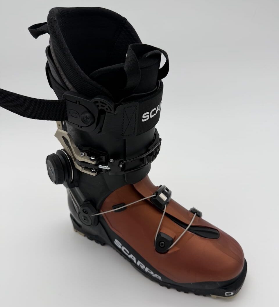
Scarpa’s new F1 RS boot features the BOA H+1 system: a first for a boot under 1800g.
Review: Scarpa F1 RS Touring Boot
-

Dean Potter highlining toward Yosemite’s Lost Arrow Spire. Photo: HBO/The Dark Wizard
The Dark Wizard Breaks Through the Noise
This four-part HBO documentary on Dean Potter shines.
-
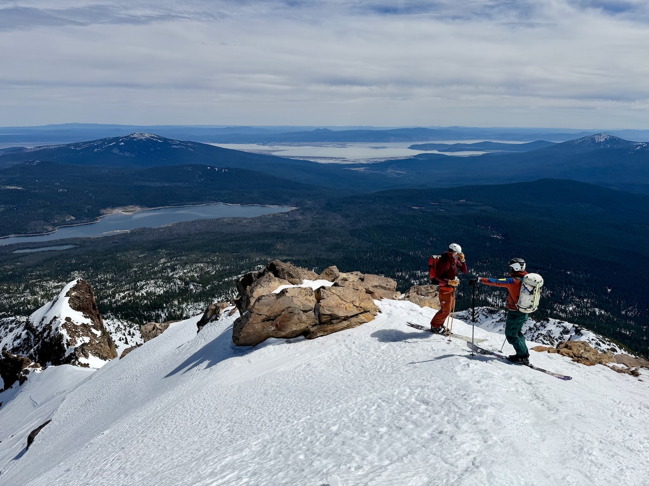
Mount McLoughlin and a fine view. This is tele-Sakana country.
Tele-Kana: Standing Forward, Moving Sideways
During this meager winter, @wicknasty finds some bliss.
-

In Alaskan terrain, being mindful of runout and alpha angles is a wise mindset. Photo: Bill Haas
Understanding Alpha and Runout Angles
Two data points to help keep it real and safe in avalanche terrain.