GOES West sat image from the North Pacific.

Sky view wx forecasting: using the GOES West sat Geo Color image of the North Pacific. Photo: NOAA


A good day in the mountains is weather dependent. We desire snow, more snow, occasional sunshine, and a refresh of snow. We check in with the meteorologist who runs skipping.org to learn about his weather forecasting workflow.


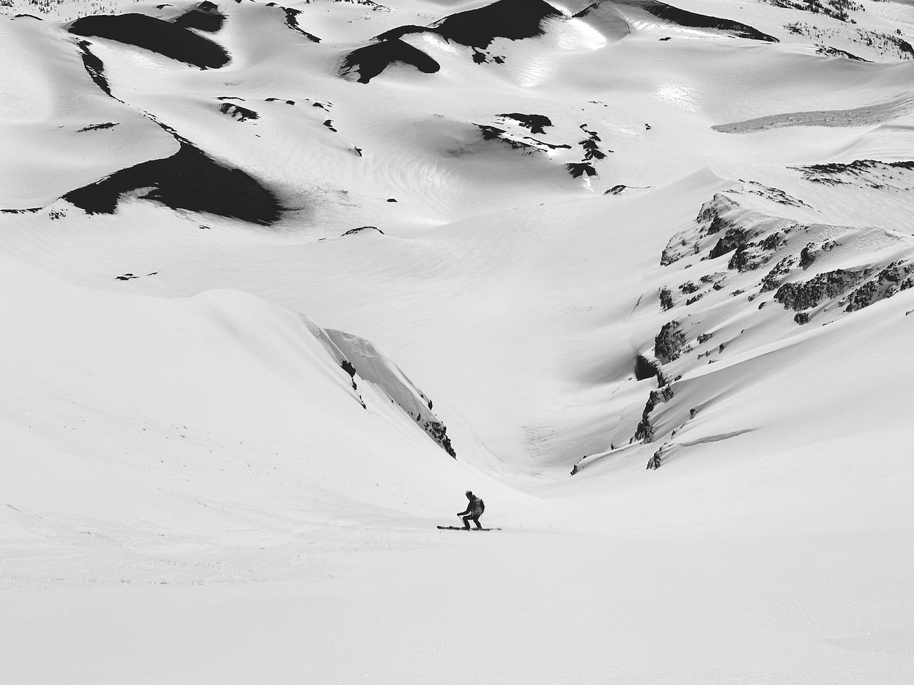
Weather forecasting, literally projecting what the future beholds, trends towards a more exact science. How precise depends on how a forecast plays out in reality rather than the predicted outcome. It can go either way; the forecasted 15″ of powder arrives overnight, just as your long-planned hut trip begins. Or, it plays out like this: the highly anticipated storm shifts south, while the skied-out terrain surrounding the hut, desperate for a re-fresh, remains the residue of cast-off tracks left by the past party at the hut. In those cases, we recommend seizing the day anyway—touring without the reward of great turns is a reward.

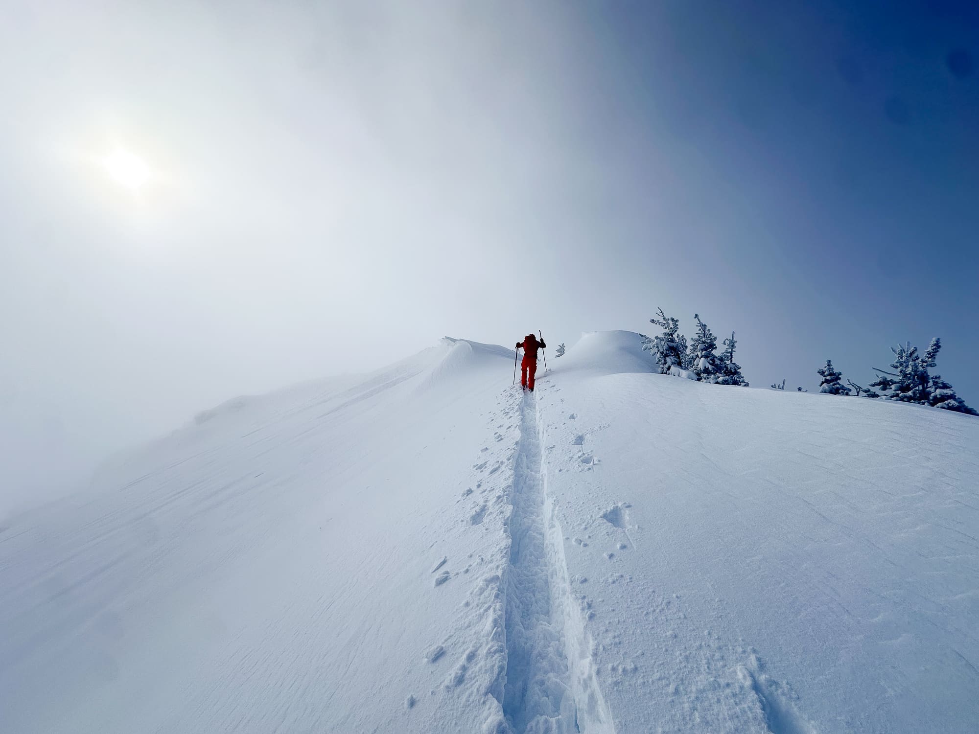
The lede here is written to say this much: weather forecasting has come a long way. Yet, as can be expected, accuracy increases forecasting in the short or close to the short-term, whereas, say, seven days out, things are still wishy-washy to some degree. If you have spent time in the backcountry, you know how this goes. Be prepared for the unexpected as the atmosphere, physically dynamic and tough to predict, is an unwieldy beast no matter how much supercomputing power you have.

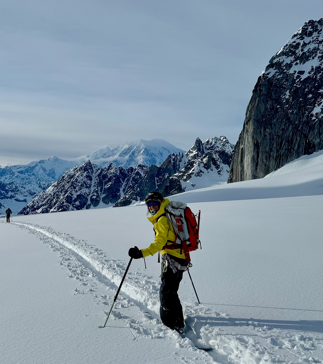
But we are hardwired, nonetheless, to predict outcomes. And to want our predictions to be accurate as planning for a known future becomes easier. So, yup, we like to forecast the weather. We’re not going down this wormhole, but wars depend on it, economies depend on it, as do the sales of powder skis lining the wall at the mountain collective near you. More importantly, backcountry smiles depend on it.

Nowadays, we have an overabundance of weather-forecasting products at our fingertips. You could refine the weather app grind and subscribe to a forecasting service. Many do. On the other hand, you can go the self-taught route, blow a forecast or five along the way, gather data via the web, and fly solo. Flying solo is doable, but following a prescribed workflow eliminates potential inefficiencies.


The SkiPig Method

First, we’re taking some forecasting cues from Joe Messina. Messina is a meteorologist in Missoula, Montana and a former avalanche forecaster. With near 100% accuracy, he’ll rip turns with aplomb in the next storm, which might catch you off guard because he effuses chillness.


The Point & Click Forecast

Joe runs a site called skipig.org, a great landing spot for learning about predictive workflows. Logically, Joe begins with an NWS point-and-click forecast to get a general idea of the forecast. This is as simple as clicking on a location on a NWS forecast map.

NWS local point snow forecast info.

A screenshot from the SLC’s local NWS point specific snow forecast.


SLC point forecast

By clicking on a specific point (in this case SLC), a basic yet data-rich forecast is rendered. (Screenshot: NWS)


The Forecast Discussion

Take your time with this next step; although early in the process, it gets a bit technical. Joe recommends reading the NWS forecasts discussion. Discussions are written for broader regions, not a specific location, and they summarize (in detail) the forecast and the forecasters’ confidence in the upcoming atmospheric patterns. One nice aspect of NWS forecast discussions is the norm of hot-linking meteorological terms the layperson may be unfamiliar with—it’s a great way to get up to speed on the meteorological geekspeak. The discussions are a goldmine and offer short and long-term analysis.


The Local Avalanche Center Weather Forecast

The SkiPig methodology then taps into the local avalanche center weather forecast. There is an asterisk here. Joe mentions that some avalanche centers have a meteorologist on staff while others do not. (Shameless plug: either way, support your local avalanche center.) An avalanche center write-up is different from a NWS forecast. Although not my local forecast center, I often reference the Northwest Avalanche Center (NWAC). NWAC has a meteorologist on staff well versed in mountain weather forecasting. At NWAC, I can get an eye on NWAC’s avalanche forecast and a mountain weather synopsis and forecast with all the pertinent data.


Getting Granular

The next step is to zoom in on a specific meteorological event. For example, in winter, when he eyes precip and wind more closely, he might use Windy to examine wind forecasts (Windy also has a full menu of forecast products). In spring, when timing is everything, determining if a hard freeze will be followed by a clear sky corn feast, Joe looks to NOAA’s Storm Prediction Center SPC) products. Specifically, the SPC provides forecasted cloud cover at low, mid, and high elevations.

The SPC is one tool. Forecasting, as long as you keep the learning curve realistic, has never had more tools at our fingertips. There’s the USDA’s SnoTel data and NOAA’s GOES Image Viewer for real-time on-the-ground data and sat images. Data gleaned from the “getting granular” products can help support or refute the forecast information presented in steps 1-3.


Postscript: Developing Weather Forecasting Skills

Gaining independence in the backcountry requires many skills. Part of the forecasting skill set means looking at maps and images with unfamiliar weather map iconography. Let’s check out weather maps displaying isobars.
Isobars illustrate air pressure.

Isobars form rings, or closed loops, often in irregular shapes. The air pressure along the isobars lines shows areas with the same air pressure. Isobar maps are also marked with Ls and Hs for low and high pressure zones, respectively.

  • Wind rotates counterclockwise in zones of Low pressure.
  • Wind rotates clockwise in zones of high pressure.
  • We associate low pressure with unsettled and inclement weather; high pressure usually means clear skies, less wind, and often cooler temps.
  • On the Windy Isobar map, a numerical reading for air pressure for surface air pressure is shown under the L or H in inches of mercury (inHg). For example, 29.92inHg is the normal air pressure at sea level.
  • As altitude changes, air pressure shifts lower.
  • Close together Isobars depict areas with higher wind speeds due to a stronger pressure gradient. Air tends to move from regions of high to low pressure.

Read part II of the SkiPig Wx forecasting method here. The High Route, in the near future, will explore specific weather forecasting products to ensure the weather doesn’t take you by surprise.