In this follow up interview with meteorologist and skipig.org creator, Joe Messina, we get an in depth analysis of his backcountry specific weather forecasting workflow.  

Joe Messina. Meterologist and ski pig.

100% unassuming. 100% pure powder slayer. That is meteorologist Joe Messina, the brains behind skipig.org. Photo: Jason Albert


The first thing that everybody should know is that there’s a room full of highly trained scientists sorting through all the weather models and all the data coming out from the National Centers of the Weather Service, Europe, and Canada. The idea behind the first step in the SkiPig workflow is just looking at the forecast by point and clicking on wherever you’re going. You’ll get a general idea of what the weather will be like that day. Instead of trying to dig into model data yourself, know that people have already done that at a high level. 

Read part I of the skipig.org weather forecasting workflow here.  


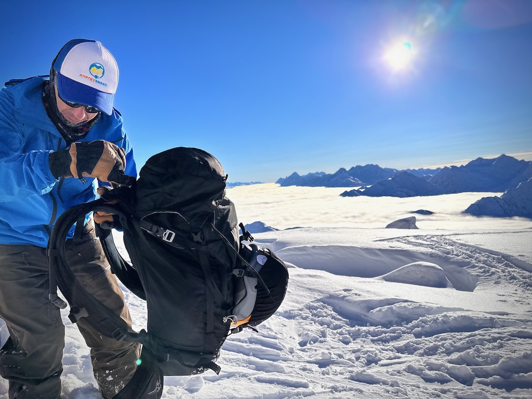
Point & Click Location 

The High Route: If we use Missoula as our point-and-click location, our point forecast, so to speak, what are you gleaning here? Just basic temperature expectations, wind, and precip type things?

Joe Messina: Yeah, the things you’re looking for as skiers are exactly those things, wind, and precip, depending on the season. So midwinter, looking at precip and wind. And then, as you get into the spring, you will begin paying more attention to sky cover, solar radiation, and warming temperatures.

THR: The next item in your workflow is the forecast discussion. And I know that local NWS forecast pages do have a link to the forecast discussion. Sometimes it just takes a moment to locate it.  

Messina: If you go down to the bottom of the page, you’ll see a bunch of links. One is the forecast discussion. Click on the link, and you are directed to a written product — it is all text, there’s no fancy graphics or images. 

The important part of reading the forecast discussion is the forecaster’s opportunity to explain what they’re thinking. And it’s a great place for forecasters to put in areas of uncertainty or lower confidence in the forecast.


The Forecast Discussion

THR: I’m familiar with forecast discussions and find them great tools. But I’m curious about the language forecasters use. For example, in places where they may be less confident in the short or long-term forecast, do they routinely use terms like “we lack the confidence” or “there’s disagreement in?”

Messina: Exactly. As you get further out with the forecast, you’ll read things like, the forecast is this or that, our confidence is low, or our confidence is high for a certain weather event to happen. One thing the National Weather Service is moving towards is using probabilities. Instead of saying an event is likely or unlikely or high or low confidence, they place a numerical probability on a weather event.

THR: Ok, so when the NWS uses terms like “lower” and “higher” probability, do they correlate to a numerical expectation? And that specific probability, the numerical expectation, isn’t necessarily written in the forecast discussion?

Messina: A lot of social science has shown that using only terms like “likely” or “unlikely” might mean different things to different people. When I say “likely,” I intend for it to be interpreted this way: it’s likely to happen, meaning an 80 to 85% chance of something happening. Someone reading that word might take it as a 99% or 95% chance that something will happen. The National Weather Service is trying to align the language in the forecast discussion to make sure everything is clear about probabilities.

THR: I think I have this correct, but the National Weather Service produces regional forecast discussions; they are not specific, for example, to a single zip code or a small set of zip codes. 

Messina: The National Weather Service is split up into County Warning Areas, but in layperson’s terms, it is a forecaster’s area of responsibility.

The discussions are really broader regional discussions.

Yes, the forecast discussions are totally regional. A forecaster will write a forecast discussion for their entire area of responsibility, but they will also highlight the significant weather events or features. For example, If a snowstorm is coming to a specific pass or mountain range, that will likely be highlighted in the forecast discussion.

THR: I enjoy forecast discussions because they push my comfort zone regarding terminology. If I don’t understand a dynamic that’s being described, it’s an opportunity for me to look that up to see what they’re talking about. What do you recommend for people that are used to letting their phone app do the work but want to get into reading and deciphering the forecast discussion? Is there a tool you recommend to get up to speed on meteorological terms?

Messina: There’s the AMS or American Meteorological Society glossary. That’s where you’ll find all the terms used in the forecast discussion. There’s another really good website, Haby’s Weather Forecasting Hints. He does a good job explaining many terms in somewhat layperson terminology. 


The Avalanche Center Mountain Forecast

THR: Missoula, for example, is a small avalanche center that also posts a mountain weather forecast. And some avalanche centers, NWAC comes to mind, have meteorologists on staff. How do you fold the avalanche center mountain weather forecast into your workflow? And what information do you look for that’s more specific than the information delivered in a specific point forecast and the broader forecast discussion?

Messina: We are lucky in Missoula to have a forecast designed for backcountry users. In a lot of other areas, the avalanche forecasters will write their own weather forecasts. When a weather forecast is posted in the early morning, it’s up to the individual avalanche centers to pick it up and do what they want with it— which means they often cut and paste it into their avalanche forecast and tweak it. 

This backcountry-specific type forecast is the third tier of getting your weather forecast and dialing it down. You should start with the point and click to get a general idea and then read the National Weather Forecast discussion to learn what the forecasters are thinking. And then you’re moving down to this next level where it’s really designed for the actual backcountry skier. 

In this type of forecast, you’re going to get more points with more mountain-specific information. You could even start the workflow here. But in general, it’s just a more mountain-specific forecast, and depending on where you are, it’ll be broken up into different elevation bands and mountain ranges. 

Let’s say there’s a concern for lower elevation snow, a snow line, for example, in this particular forecast, where it might be harder to glean that out of the point-and-click forecast or the forecast discussion.


Weather Prediction Center

THR: Ok, at this point, we have a local forecast and, if possible, a more detailed mountain forecast catered to winter recreationists. According to your workflow, you then pivot to the NOAA/NWS Weather Prediction Center (WPC). How do you use this forecasting product?

Messina: So the WPC product is the Weather Service’s way of putting precipitation probability into the forecast. Let me step back a bit. Predicting snow is really hard. There are a lot of factors that go into it. There’s the amount of snow, the liquid ratio, where the snow levels are, the wind, and accumulation totals on different aspects. There are predicting different amounts of snow under different wind directions. It all gets pretty complicated. It’s not just like predicting a rainstorm.

My take is that the Weather Service feels that using probabilities is the best way to help people out with these forecasts. The whole idea behind this is you can use a bunch of different options. We have dates running three days into the future on the top menu bar. Running along the Y-axis for those dates, we have the probabilities for “Excessive Rainfall,” “HEAVY SNOW (≥ 4″),” and “ICE (≥ 0.25″).” If you click on the probability under the date you are looking for, a map illustrating the locations for those probabilities pops up. But it’s August, so yeah, the probability is low. Normally, in winter, we’d see the likelihood of snow depicted by specific color codes overlaid on the map. Again, those colors speak to the probability for the snowfall amounts to occur. 

THR: Weather forecasting technology has gotten a lot better. I’m assuming the predicted outcome is much closer to the actual outcome than it was when I was growing up—the positive correlation is closer than in the past. So, for example, if you see a 70% chance of snow, what does that mean to you?

Messina: It means it’s a high-confidence event. It means that a lot of model guidance is pointing in the same direction. And when you start to see that, your confidence goes up that it will be a significant event. 

Weather forecasters have shifted more towards using something called ensemble forecasting, which is the use of many different model runs versus just a few. So for each different model now, forecasters will have an ensemble of solutions. And as that variety of solutions converges or synchs closer to a single outcome, we start to get very excited. That means as you add smaller perturbations into the atmosphere, they’re still converging on the same outcome. And that’s a big deal. That’s pretty exciting. This means that confidence is building that that particular outcome is likely. 


SNOTEL sites and more

Huge potential to access remote info for snow-on-the-ground data. Screenshot: NRCSNW & CC


SNOTEL

THR: The next level on the SkiPig (I love saying that) weather workflow is interactive snow information: thighs like real-time snow depth. So how do you use this, and how does that type of data fit into your tour planning?

Messina: These tools allow us to look at observations versus forecasts. Simply put, these are just observations of satellite-detected snow on the ground. 

(Note:  the satellite product is from NOHRSC, the National Operational Hydrologic Remote Sensing Center, not SNOTEL)

And you are looking at this to verify what a forecast may have predicted before heading out unnecessarily with the ski gear?

Yeah. But, it’s not the best for forecast verification. I prefer a point forecast like SNOTEL. NOHRSC is more of a big-picture type of thing. SNOTEL, the next step in the workflow, is the program focused on measuring snow on the ground. And they’ve got sites all over the mountains in the West.

There are a couple of different ways that it measures. And I think it’s kind of important that people realize the limitations of using SNOTEL data. SNOTEL uses two different ways to measure snow. One uses a snow pillow— a snow pillow is a Hypalon bladder filled with an antifreeze solution. And as snow falls on it, it detects the weight of the snow above it. And from that, you can get the inches of water equivalent in the snowpack. (Note that water equivalent is different from snow depth.)

In the avalanche and water availability world, that’s super important. We always talk about inches of water because we’re worried about the weight of new snow introduced to the existing snowpack. From an avalanche hazard standpoint, the actual inches of snowfall are kind of secondary to the amount of weight introduced to the weak layers.

There’s another sensor called a snow depth sensor. And that measures the actual snowfall in inches. The way that works is it shoots a sonic beam down from above; it’s mounted up on a tall tower, and it shoots a sonic beam down from above and measures the time it takes for the beam to return to the sensor. As that length of time shortens, it means the snowpack is increasing, and it’s starting to register snowfall. 

There’s a problem with that, and I think people get frustrated or confused because those things appear to stop working when it’s snowing hard. The reason is that there’s a lot of interference in the air. A lot of snow is falling, and that snow interferes with the signal. It can be frustrating because when there’s a big storm, you’re looking at those snow depth sensors, and every time it snows, they quit working. This is why they quit working. 

THR: During a big storm, the site registers a flawed value?

Messina: You get a really bogus number. A really big number usually, or, like, a -99. If you check out the site post-storm, accurate snow accumulation numbers register again after it’s stopped snowing. The good news is you do eventually see how much it snowed. But during a big storm cycle, it might be a while before you get some good data.

In California this year, Mammoth, for example, I was looking at the measuring site there. I just gave up on it after a while because it was just snowing and snowing and snowing. 

THR: Anything else you want to note about SNOTEL sites in general?

Messina: People should realize that SNOTEL is designed to measure the amount of snow a storm produces or that collects on the ground. Their function is for water supply forecasting. So they’re not really designed as short-term weather observing sites: they are designed as more of a seasonal, long-term measuring site. So they’re put in places that are catching a lot of snow, you know, not on ridge tops, they’re in sheltered areas, and they’re put there for that very reason. We want to get an idea of how much snow a basin collects versus what’s going on a ridgetop— those numbers will be different. When you look at SNOTEL data, realize that the position of that measuring site might not be where you’re skiing, it might be a little bit lower, sheltered, and a relatively flat area not affected by the wind. So from a skiing and elevation standpoint, it’ll give you a good idea of what the storms are producing, but you will likely get to the ridge tops or the bowl you’re skiing and find different conditions.

THR: That’s good information. I often look at SNOTEL sites, and having your perspective on that is informative. But I suppose it is like looking at Mt. Bachelor’s snow cam in the early AM and seeing 12″ of snow. I know the gauge is in a “protected” spot, away from wicked winds. If there’s 12″ on the cam, that could be a solid 2 feet on some leeward slopes. Anyway, always keep your eyes peeled wide in the backcountry.


Climate Prediction Center

THR: OK, so the next piece in the workflow is more long-term; it’s the climate outlook.

Messina: I’d call that a trip-planning piece—it’s the Climate Prediction Center. It’s another big NOAA National Weather Service affiliated research center. Folks refer to them as the National Centers, like the Weather Prediction Center, the Storm Prediction Center, and Climate Prediction Center. The CPC issues longer-term outlooks, and they monitor El Nino very closely. So these are the climate experts giving their input on what to expect in different timeframes. They offer a product that is shorter in outlook, like a couple of week timeframe, and then a longer-term outlook, all the way out to a three-month outlook.

I like these, but you need to be cautious; they’re pretty coarse. These forecasters are great with what they do, but be cautious using this as a hardcore planning tool. Like any weather forecast, the farther you go out with the forecast, the more you’re leaning more on statistical analysis versus actually looking at the atmosphere to see what’s happening long-term.

THR: It’s not quite a Farmer’s Almanac, though.

Messina: No, it’s not. You’re right. More research, statistics, and science are put into this, and I don’t even know how the Farmer’s Almanac works. But I’m kind of intrigued by it. 

THR: I don’t know either, but it seems like there’s been a huge return on investment on perhaps what has been little and very low-tech infrastructure investment.


GOES

THR: Next, you have your GOES sat imagery. I love looking at these. How do you use this satellite data? 

Messina: GOES imagery is great to see what’s actually happening in the atmosphere, and I love it. If I’m reading someone’s forecast discussion, I will pull up the satellite and see if I can pick those features out. It can be a little bit of a challenge. 

To me, the satellite images tie the forecasts into what’s reality. For example, if there’s a cold front coming, I can see that on a water vapor image, or if there’s a low-pressure circulation, I can see that on visible or IR. That’s what I love about satellites: it ties reality with written words, cool graphs, and pretty pictures.

I use two primary GOES images; one is the Geo Color, it’s in the upper left on the main GOES site, and Clean IR, which is the leftmost image on the bottom row. 

For me, Geo Color is great because it’s like visible satellite on steroids: you get a really cool picture of the Earth’s surface as well as the weather features, and it’s easy to pick out mountain ranges and snow cover during the daytime, anyway. You can also see different cloud types. 

And for all the GOES images, I use the animated loops rather than the JPEGs, because you can see circulations and see things moving. 

Clean IR, which is infrared,  is like night vision for satellite imagery, because it uses the infrared spectrum, you can use weather features at night. There is a nighttime Geo Color color product, but for the most part, any visible product doesn’t work when it’s dark out. 

So if you want to look at something once the sun has set, at night, let’s say you’re getting up early in the morning, and you want to see how a storm is progressing, the visible satellite does no good. You want to use an IR product. 

I also like to use the Water Vapor products.  These are nice tools to pick out fronts and circulations. These GOES images are like Polaroid pictures; it’s a snapshot of what is happening.

A big part of using these images is determining the timing of storms. We have our model runs and our computer simulations, which are coming out before these systems arrive in our area.

And then, as you get closer and closer to the event, you start seeing these on the satellite; you start seeing them develop and start to move. There are often discrepancies, and the images might not always align perfectly with your model output. With the images, you get a visual that gives some rough validity (or lack of validity) to what the models have predicted. 

But also, these images are predictive too. You can see systems moving in from the west, and in a place like Missoula, you can also see systems coming in from the east, which sometimes occurs in winter.

There are a lot of geeks out there, just like me, who want to see this stuff. I want to caution people against leaning on one model. You know, it’s something that is a huge no-no. You might want to place your luck and energy into the one model predicting the 18″ of cold snow. But if you need to look around and get ensemble guidance. The model predicting the 18″ might be the outlier. A word of caution: Leaning on one specific model can be dangerous and misleading.