From this perch looking south, seeing terrain through the ATES lens. Photo: John Sterling

From this perch looking south, seeing terrain through the ATES lens. Photo: John Sterling


The ATES is a solid tool to both assess terrain in realtime, and plan a trip. In this ATES installment, we use a trip planning tool with an ATES overlay to begin eyeing potential touring terrain.


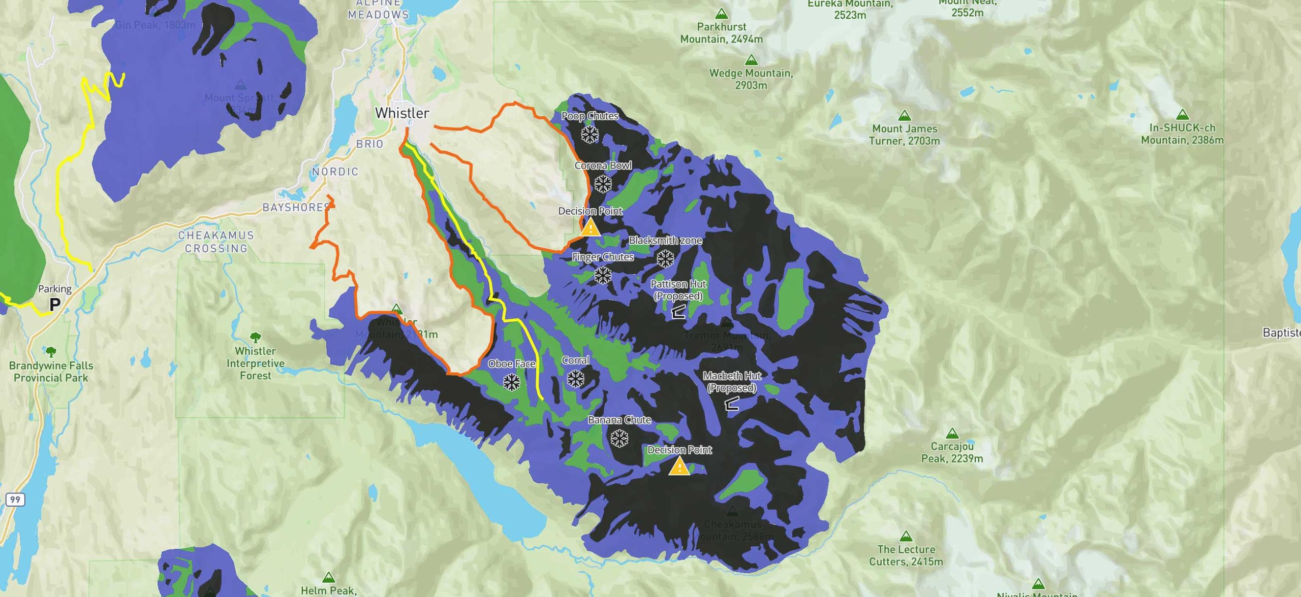
Last Friday concluded the ISSW2023, or the International Snow Science Workshop. We published a piece on ATES v.2, which was presented at ISSW as a new template for the well-established ATES, also known as the Avalanche Terrain Exposure Scale. In short, the ATES scale describes one’s exposure to a potential avalanche. The initial version of ATES uses a three-tiered scale communication model: simple, challenging, and complex. Each description is aligned with a color for easier ATES applications on maps where green is simple, blue is challenging, and black is complex. As explained in the ATES v.2 article, an ATES description is static; it does not change with a daily or weekly avalanche forecast.     

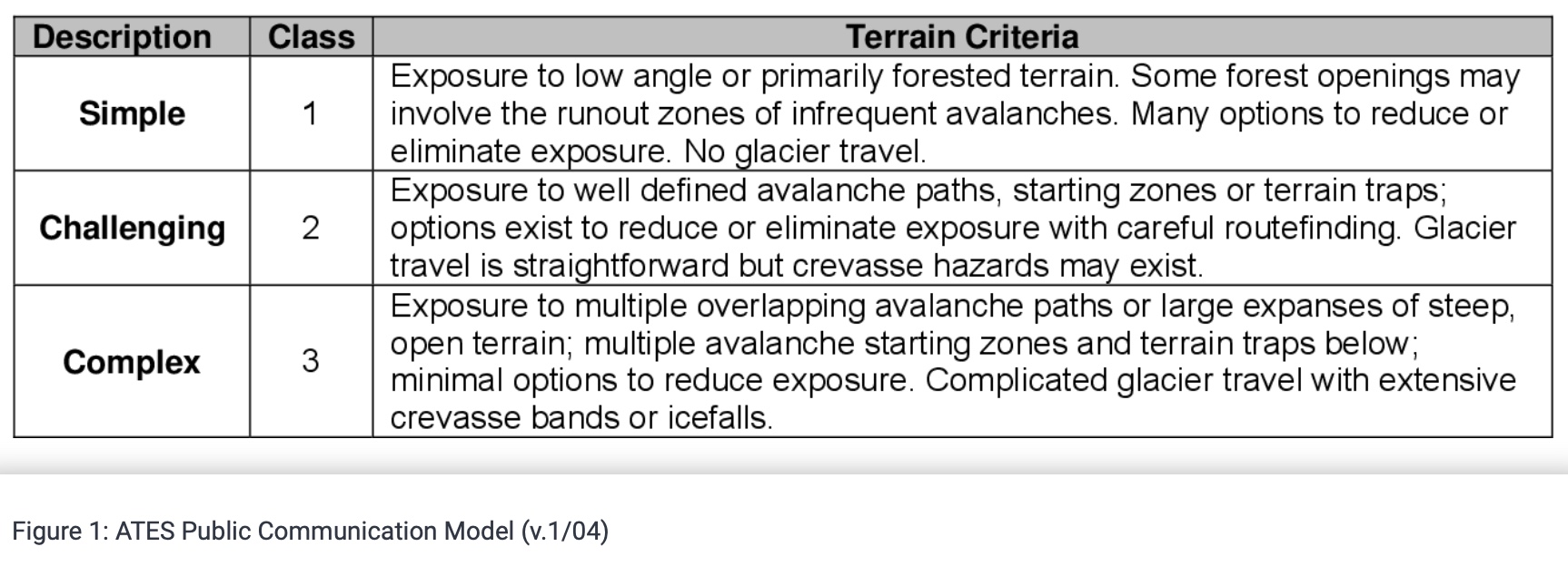
When ascertaining information about the terrain and designating an ATES description, avalanche professionals use a technical ATES model. In the original ATES technical model published in 2004, we see below that data on slope angle, interaction with avalanche paths, and exposure time, among other parameters, are considered.

ATES Technical Model (v.1/04)

ATES Technical Model (v.1/04)

Real-world use of an ATES, at least for me, comes into play when I intend to explore unfamiliar terrain. So, pending a healthy knee, I’m eyeing some traverses in the Whistler-Blackcomb area this season. 

A great and free resource, (although it must cost Avalanche Canada money to produce and host), is their trip planner. I load the planner, and scroll and zoom on the Whistler zone to view specific terrain overlaid with ATES descriptions. The map provided is suitable for a first-step analysis: it is 2D, and once zoomed in sufficiently, populates with topo lines and even a track, for example, of the Spearhead Traverse. Again, I’m assessing a route many hundreds of miles south of Canada, and it’s still Fall. Yet, I can begin to analyze what type of avalanche exposure I can expect on the traverse. Here, in these screenshots, we see the preferred traverse line travel from blue to green, to blue, and into black ATES terrain. 


A semi-zoomed out view of the Whistler-Blackcomb region overlaid with ATES descriptions. This excellent trip planner is available on Avalanche Canada's site.

A semi-zoomed out view of the Whistler-Blackcomb region overlaid with ATES descriptions. This excellent trip planner is available on Avalanche Canada’s site.


A more zoomed in look at the Spearhead zone with the ATES overlaid.

A more zoomed in look at the Spearhead zone with the ATES overlaid.


And...zoomed in closer to illustrate how one might use this planning tool to assess route options (in the panning stage).

And…zoomed in closer to illustrate how one might use this planning tool to assess route options (in the panning stage).

The Avalanche Canada trip planner also includes a basic legend with the symbols defined below. The symbols are straight forward and provide visual cues of potential hazards.

Map legend for Avalanche Canada's ATES trip planner tool.

Map legend for Avalanche Canada’s ATES trip planner tool.


The user is prompted to have a heightened sense of situational awareness.

The yellow caution/desicion point symbol prompts the user to have a heightened sense of situational awareness.

And… there’s more. You can download a KMZ file from the trip planner, which can be imported into Google Earth (SEE below), as one builds out a digital rendering of a proposed route. That said, I tend to default to FatMap, but all these mapping apps are good, and let’s assume each of us chooses a platform that feels right, whether it is FatMap, Gaia, Cal-Topo, or OnX. 

For me, FatMap has some nice info on the traverse I’m eyeing. However, it does not include ATES information. As an exercise, I’m building out some data in Google Earth and will eventually import a file into my app of choice to see what I can develop. That’s a piece for a few weeks from now. 

The KMZ file (downloaded from the Avalanche Canada trip planner) and imported into Google Earth. The ATES data is overlaid on Google Earth's sat image.

The KMZ file (downloaded from the Avalanche Canada trip planner) and imported into Google Earth. The ATES data is overlaid on Google Earth’s sat image.

All this is to say that ATES ratings have a place. They shine, for me, when I’m considering new terrain. Further, the power of ATES is amplified when used in conjunction with a specific (and professional) avalanche forecast, that includes the problem of the day, weather data, and danger rating. If a forecast calls for a spicy danger rating, and say, for example, there’s newly fallen snow and wind loading, an ATES comes into play when assisting with the trip plan and whether to stick with the agreed upon objective or to pivot and derive a tour in a zone better aligned with the forecast. Knowing the ATES in the surrounding hills can help make those choices easier.